6.8 KiB
sidebar_position
| sidebar_position |
|---|
| 5 |
Main Scene
This is where all the magic happen.
Main scene is the most complicated scene with hundreds of object, script and config.
Yet it is suprisingly simple to use.
By following step by step setup, you'll have a working main scene in no time.
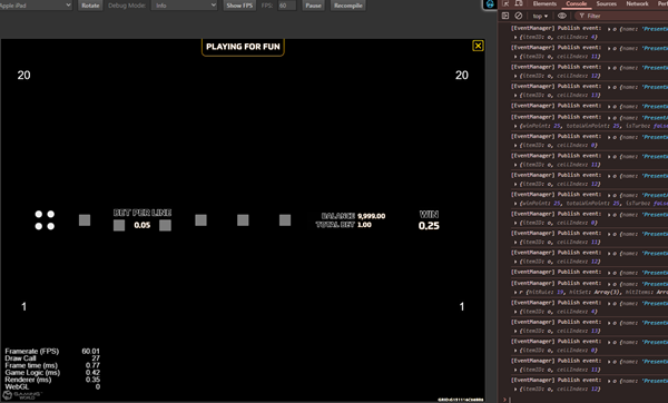
:::info In fact, if all of the other scenes are setup properly, you can even run test the game without any setup on main scene.
Try to run the project, you'll the result as below. It doesn't look like much but it is actually a game running without visual assets.
 :::
:::
Setup Reel Slot
-
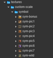
Prepare the asset for symbols.
-
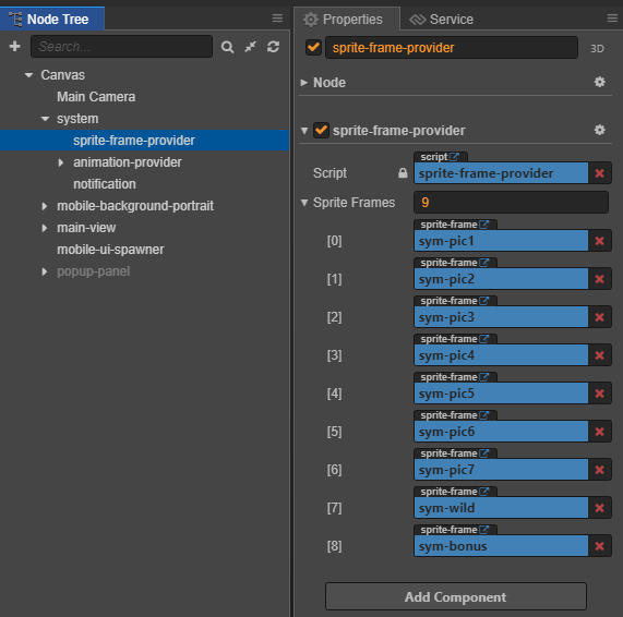
Add symbols to SpriteFrameProvider which allows those symbols to be accessed globally from the code.
-
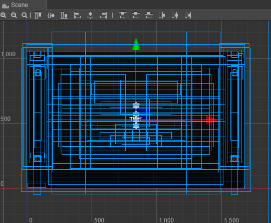
Config reel slot using
reel-scroller-helper.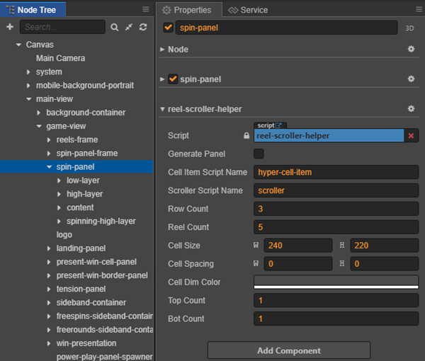
Properties Explaination Example Cell Item Script Name The name of the script will be attached to each cell item. 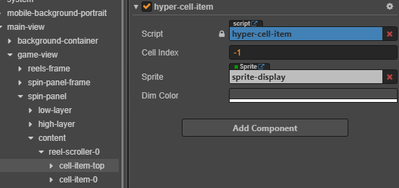
Scroller Script Name the name of the script for handling the spinning logic. 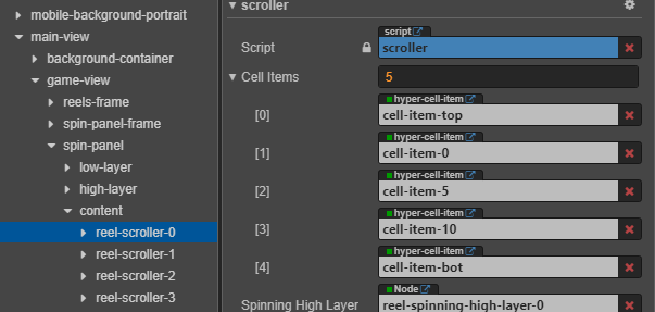
Row Count x Reel Count the number of Slot Item each row and column in the reel slot panel. 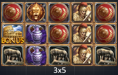
Cell Size the size of each cells. 
Cell Spacing the distance between each cells horizontally and vertically. Cell Dim Color set the dark color for the non-win cells when showing winning animation for each line. 
Top Count and Bot Count for spinning logic to work, a certain number of cell will be added to the top and bottom of the reel. 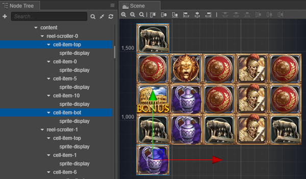
-
Generate panel using
reel-scroller-helper.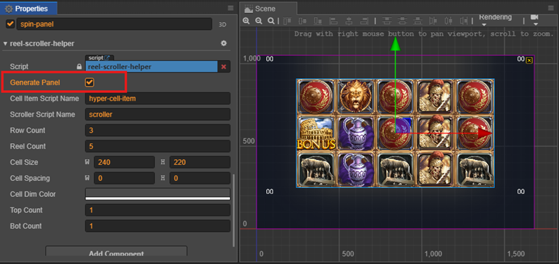
:::tip There is a popup panel covering the entire game scene. You should turn off this panel to see the other component clearly. :::
Setup Spinning Panel
Reel slot panel is just one part one the spinning panel.
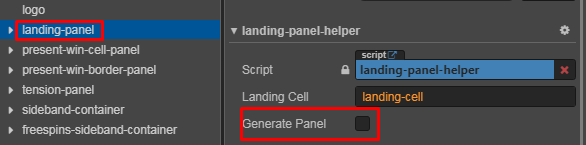
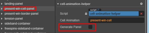
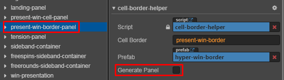
There are other panels that need to be setup: landing-panel, tension-panel, present-win-cell-panel and present-win-border-panel.
The setup is very straightforward by using the Generate Panel command in each panel's helper class.
-
Landing Panel:
-
Present Win Cell Panel:
-
Present Win Cell Panel:
-
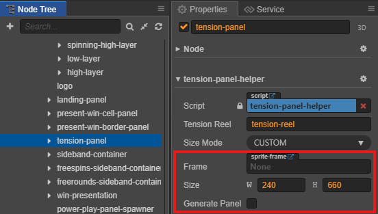
Tension Panel:
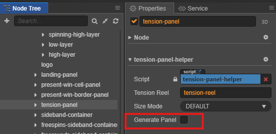
If the tension use a custom size frame, we can change the option sizeMode to Custom and set the static frame and size.
Setup UI Panel
UI Panel Overview
Available Layouts
The UI system supports both desktop and mobile layouts design.
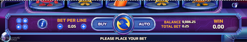
🖥️ Desktop Layout
- Full bottom bar with all controls visible
- Horizontal layout maximizing screen width
📱 Mobile Layout
The mobile interface adapts to both landscape and portrait orientations:
| Orientation | Preview |
|---|---|
| Landscape | 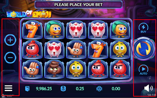 |
| Portrait | 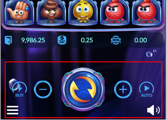 |
1️⃣ Add Prefabs For Desktop
Step 1: Setup Prefab Files
-
Locate Required Prefabs
- Find
ui-bottom-bar-panelprefab
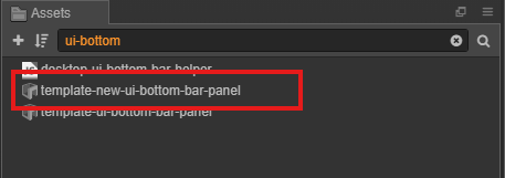
- Find
-
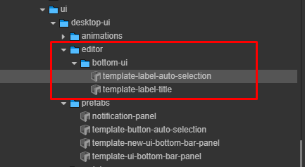
Copy UI Assets
- Go to core/editor directory
- Copy the
bottom-uifolder
-
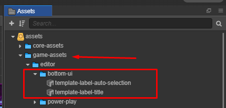
Place Assets in Game Directory
- Paste the copied
bottom-uifolder
- Paste the copied
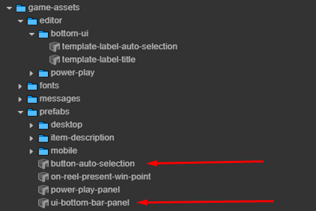
Step 2: Configure Prefabs
-
Core Prefabs

-
Copied Prefab
At here:
| Prefix to Remove | Original Prefab Name | Final Name |
|---|---|---|
template-new- |
template-new-ui-bottom-bar-panel |
ui-bottom-bar-panel |
template- |
template-button-auto-selection |
button-auto-selection |
Button Auto Selection Label
Use template-label-auto-selection to customize the button-auto-selection:
- Modify text color
- Add Label Outline component
- Add Label Shadow component
Ui Bottom Bar Panel Label
Use template-label-title to customize the ui-bottom-bar-panel:
:::tip
Detailed configuration the same Button Auto Selection Label
:::
Bottom bar labels include a localization component for multi-language support:
FormatText
The FormatText property controls text formatting behavior for label components:
| Property | Description | Example |
|---|---|---|
default |
Initial formatting state | false |
notify |
Formatting update callback | Updates when value changes |
Step 3: Apply Textures
-
Run the Helper Tool
- Open the UI Desktop Helper
- Select texture assignment options
-
Verify Results
Auto Selection Component

Bottom Bar Component
:::tip Success Verification
✔️ Check all textures are correctly mapped
✔️ Verify button states display properly
✔️ Confirm UI layout matches design
:::
Setup Background
To Be Added:
- show how many background: desktop, mobile, main game, free game, gamble, reel bg, slot panel bg.
Setup Animation Provider
To Be Added:
- How to run helper / p4f menu
- How to setup static frame / fps
Setup Popup Panel
To Be Added:
- Prepare the asset
- Run helper / p4f menu or setup manually