8.6 KiB
8.6 KiB
sidebar_position
| sidebar_position |
|---|
| 11 |
Mobile UI Panel
Overview
The mobile interface adapts to both landscape and portrait orientations:
| Orientation | Preview |
|---|---|
| Landscape | 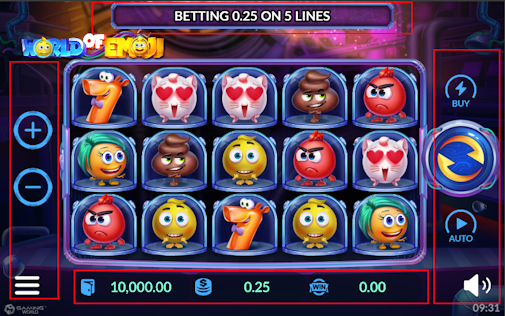 |
| Portrait | 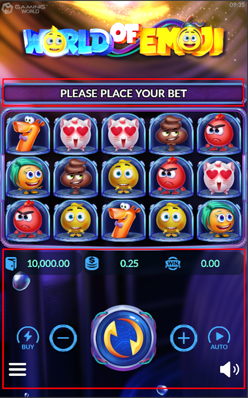 |
Step 1: Set Up Prefabs
| Step | Action | Description | Image Reference |
|---|---|---|---|
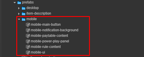
| 1 | Locate mobile-ui Prefab |
Search for the mobile-ui prefab |
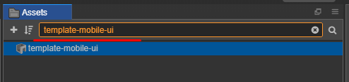 |
| 2 | Clone Assets | Copy the required assets | 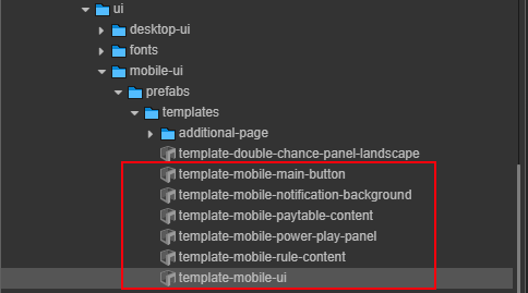 |
| 3 | Paste Assets | Paste into: assets/game-assets/prefabs/mobile |
- |
| 4 | Locate buy-feature Prefab |
Search for the buy-feature prefab |
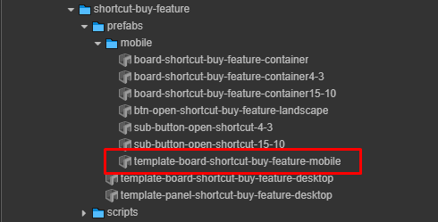 |
| 5 | Paste Prefab | Paste into: assets/game-assets/prefabs/mobile |
- |
:::tip File Structure Maintain this directory structure for proper prefab references:
assets/
└── game-assets/
    └── prefabs/
        └── mobile/
            ├── Exp: mobile-ui.prefab
            └── Exp: buy-feature.prefab
:::
Step 2: Rename Prefabs
Rename the copied prefabs by removing unnecessary prefixes:
| Prefix to Remove | Final Name |
|---|---|
template- |
 |
Step 3: Configure UI in Main Scenes
Create new node and configuration in your main scene:
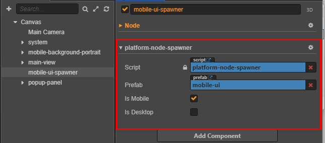
Platform Node Spawner Settings
| Setting | Value | Description |
|---|---|---|
| Mobile Toggle | ✓ Enabled | Show prefabs for mobile platform |
| Desktop Toggle | ☐ Disabled | Hide prefabs for desktop platform |
| Target Prefab | mobile-ui |
References prefab |
Step 4: Apply Textures
Texture Mobile UI
Checklist assets completed for Mobile UI
:::info
🔗 Click here to follow the setup pack assets
:::
Run the Helper Tool
To configure the mobile UI helper. :::info 🔗 Click here to follow run helper :::
Step 5: Set Color Theme for Mobile Menu UI
Follow Design:
|
|
|---|
Overview
The helper-paint-color-ui-mobile.js component is a customizable color painter for various UI elements in a MOBILE UI. It allows designers and developers to easily apply theme-based colors across the game interface.
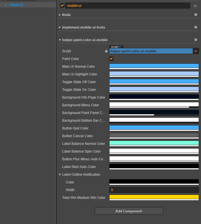
| Ordinal number | Properties | Explaination | Example |
|---|---|---|---|
| 0 | paintColor | Trigger to repaint UI components |  |
| 1 | Main Ui Normal Color | Default color of UI elements |                  |
| 2 | Main Ui Highlight Color | Highlight color for selected UI elements |   |
| 3 | Toggle State Off Color | Color of toggle when off |  |
| 4 | Toggle State On Color | Color of toggle when on | 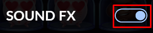 |
| 5 | Background Info Page Color | Info screen background | 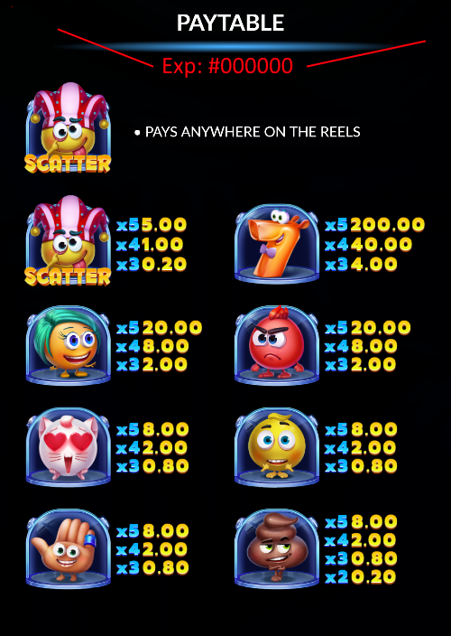 |
| 6 | Background Menu Color | Menu background color | 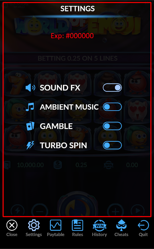 |
| 7 | Background Point Panel Color | Background panel for point/balance UI |  |
| 8 | Background Bottom Bar Color | Background bottom bar (show only mobile portrait) | 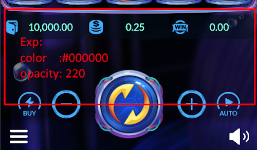 |
| 9 | Button Quit Color | Quit button color | 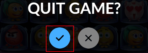 |
| 10 | Button Cancel Color | Cancel button color | 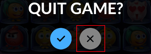 |
| 11 | Label Balance Normal Color | Normal balance label color | 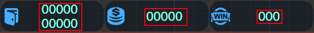 |
| 12 | Label Balance Spin Color | During-spin label color | 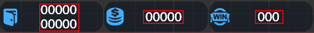 |
| 13 | Button Plus Minus Auto Color | Button plus/Minus autoplay | 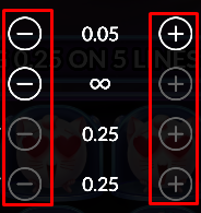 |
| 14 | Label Start Auto Color | Start autoplay label | |
| 15 | Label Outline Notification | Outline color + width config |  |
| 16 | Total Win Medium Win Color | Color for label medium win | 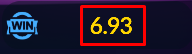 |