5.6 KiB
sidebar_position
| sidebar_position |
|---|
| 11 |
Mobile UI Panel
Overview
The Mobile UI provides a responsive interface for gameplay controls, adapting to both Landscape and Portrait orientations on mobile devices.
| Orientation | Preview |
|---|---|
| Landscape |  |
| Portrait | 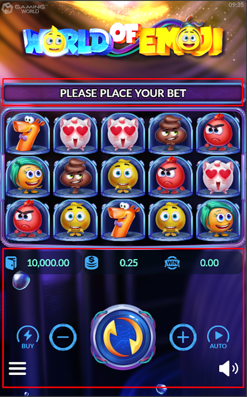 |
Implementation
Step 1: Set Up Prefabs
Configure the necessary prefabs for the Mobile UI.
| Step | Action | Description | Image Reference |
|---|---|---|---|
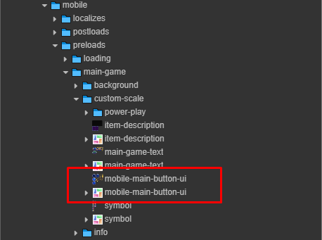
| 1 | Locate mobile-ui Prefab |
Search for the mobile-ui prefab in the project assets. |
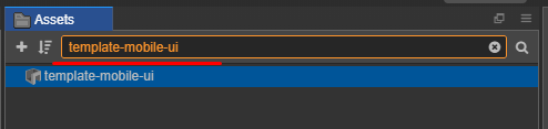 |
| 2 | Clone Assets | Copy the required assets to the game assets directory. | 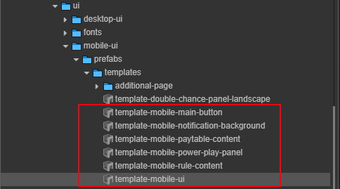 |
| 3 | Paste Assets | Paste into: assets/game-assets/prefabs/mobile. |
- |
| 4 | Locate buy-feature Prefab |
Search for the buy-feature prefab. |
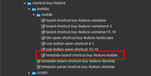 |
| 5 | Paste Prefab | Paste into: assets/game-assets/prefabs/mobile. |
- |
Tip: Maintain the following directory structure for proper prefab references:
assets/
└── game-assets/
    └── prefabs/
        └── mobile/
            ├── mobile-ui.prefab
            └── buy-feature.prefab
Step 2: Rename Prefabs
Rename the copied prefabs by removing unnecessary prefixes to ensure consistency.
| Prefix to Remove | Example |
|---|---|
template- |
 |
Step 3: Configure UI in Main Scene
Add and configure a new node in the main scene to integrate the Mobile UI.
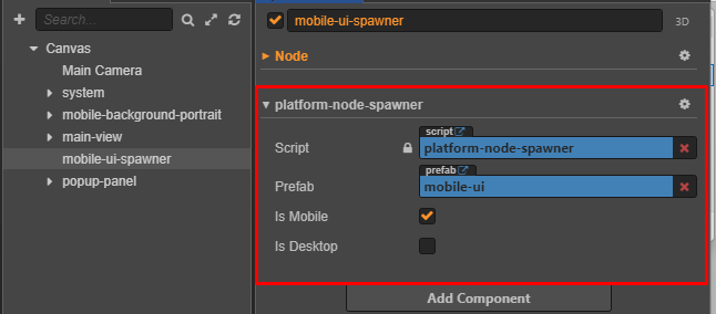
Platform Node Spawner Settings:
Step 4: Apply Textures
Ensure all Mobile UI assets are prepared and applied correctly.
Run the Helper Tool:
- Use the Mobile UI helper tool to configure the UI components.
Step 5: Set Color Theme for Mobile UI
Customize the color theme for the Mobile UI using the helper-paint-color-ui-mobile.js component to apply theme-based colors across UI elements.
Follow Design:
| Landscape | Portrait |
|---|---|
|
|
Configuration Steps:
-
Access the Helper Component:
- Locate the
helper-paint-color-ui-mobile.jscomponent in the node inspector. 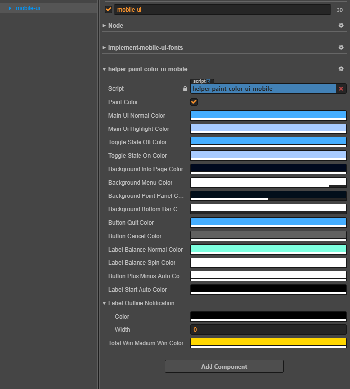
- Locate the
-
Configure Color Properties:
- Adjust the following properties to match the game design:
| # | Property | Description | Example |
|---|---|---|---|
| 0 | Paint Color | Triggers repainting of UI components. | 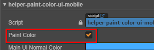 |
| 1 | Main UI Normal Color | Default color for UI elements (e.g., Buy, Close, Auto). |  |
| 2 | Main UI Highlight Color | Color for highlighted or selected UI elements. | 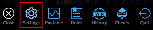 |
| 3 | Toggle State Off Color | Color for toggles in the off state. |  |
| 4 | Toggle State On Color | Color for toggles in the on state. |  |
| 5 | Background Info Page Color | Background color for info pages. |  |
| 6 | Background Menu Color | Background color for menus. | 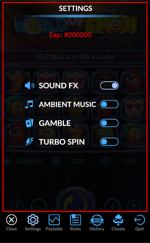 |
| 7 | Background Point Panel Color | Background color for point/balance panels. |  |
| 8 | Background Bottom Bar Color | Background color for the bottom bar (Portrait only). |  |
| 9 | Button Quit Color | Color for the Quit button. |  |
| 10 | Button Cancel Color | Color for the Cancel button. |  |
| 11 | Label Balance Normal Color | Color for the balance label in normal state. | 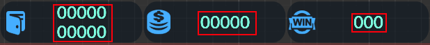 |
| 12 | Label Balance Spin Color | Color for the balance label during spins. | 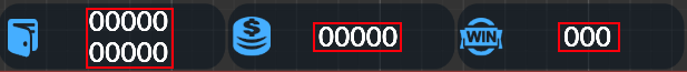 |
| 13 | Button Plus/Minus Auto Color | Color for Plus/Minus buttons in autoplay. | 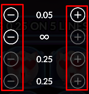 |
| 14 | Label Start Auto Color | Color for the Start Autoplay label. |  |
| 15 | Label Outline Notification | Outline color and width for notifications. |  |
| 16 | Total Win Medium Win Color | Color for medium win labels. |  |
Tip: Ensure color values align with the game’s visual design specifications.