22 KiB
sidebar_position
| sidebar_position |
|---|
| 5 |
Main Scene
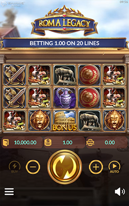
This is where all the magic happen.
Main scene is the most complicated scene with hundreds of object, script and config.
Yet it is suprisingly simple to use.
By following step by step setup, you'll have a working main scene in no time.
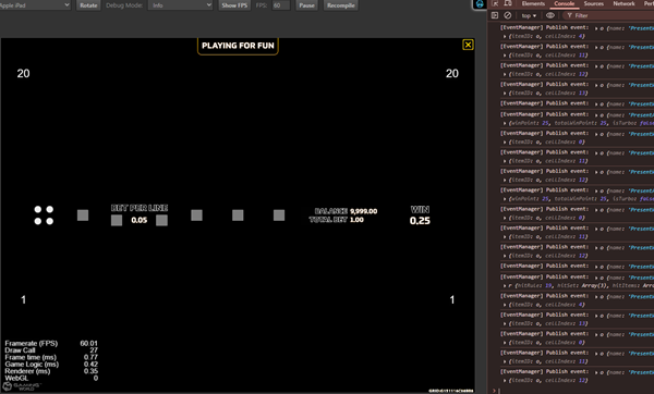
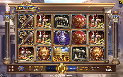
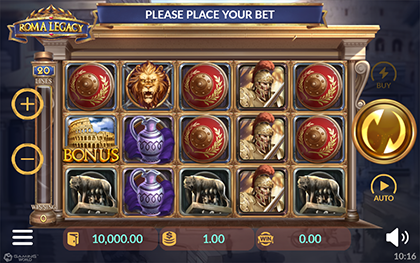
:::info In fact, if all of the other scenes are setup properly, you can even run test the game without any setup on main scene.
Try to run the project, you'll the result as below. It doesn't look like much but it is actually a game running without visual assets.
 :::
:::
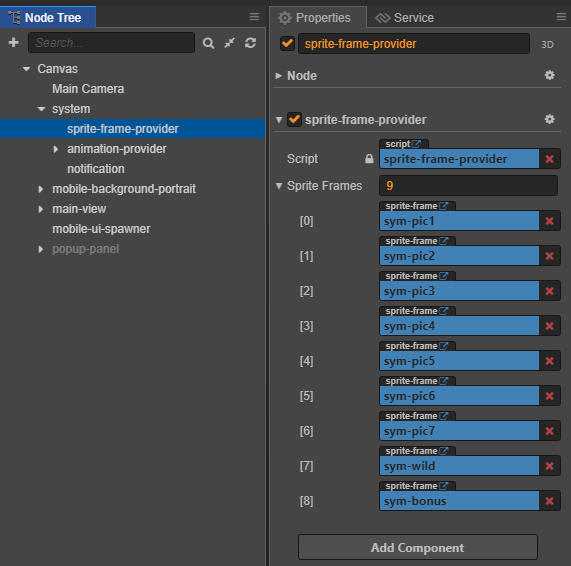
Setup SpriteFrame Provider
**SpriteFrameProvider** allows global access to "sprite frames" from code.

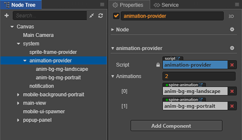
Setup Animation Provider
**Animation Provider** contains all **animations** of the game.

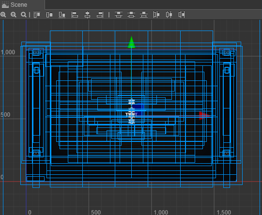
Setup Reel Slot
-
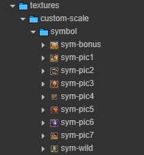
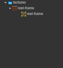
Prepare the asset for symbols and reel frame.
-
Add symbols to SpriteFrameProvider which allows those symbols to be accessed globally from the code.
-
Add reel frame.

-
Config reel slot using
reel-scroller-helper.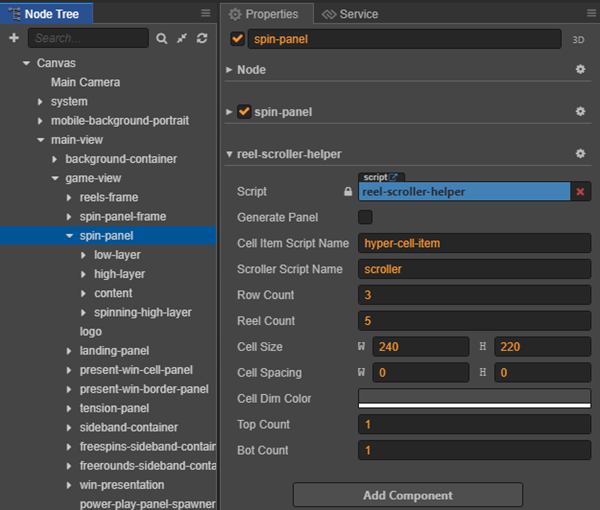
Properties Explaination Example Cell Item Script Name The name of the script will be attached to each cell item. 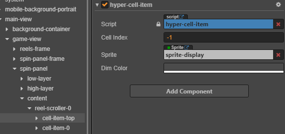
Scroller Script Name the name of the script for handling the spinning logic. 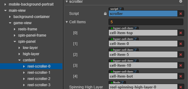
Row Count x Reel Count the number of Slot Item each row and column in the reel slot panel. 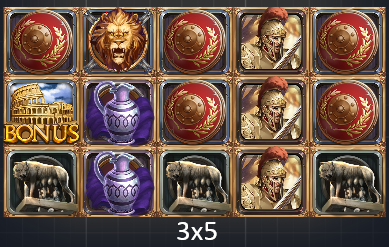
Cell Size the size of each cells. 
Cell Spacing the distance between each cells horizontally and vertically. Cell Dim Color set the dark color for the non-win cells when showing winning animation for each line. 
Top Count and Bot Count for spinning logic to work, a certain number of cell will be added to the top and bottom of the reel. 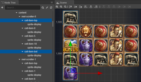
-
Generate panel using
reel-scroller-helper.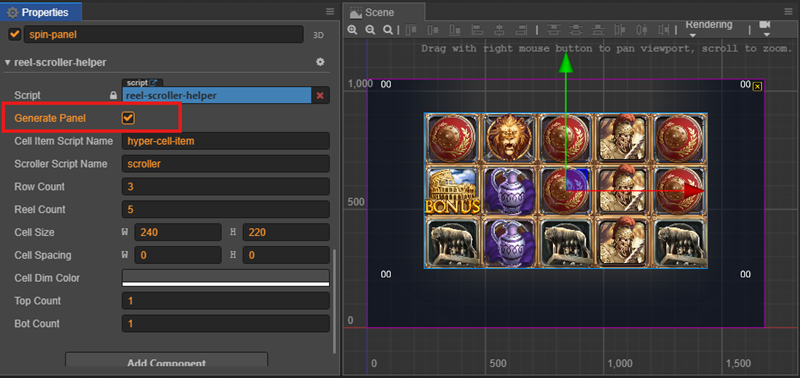
:::tip There is a popup panel covering the entire game scene. You should turn off this panel to see the other component clearly. :::
Setup Spinning Panel
Reel slot panel is just one part one the spinning panel.
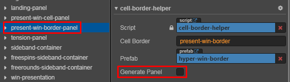
There are other panels that need to be setup: landing-panel, tension-panel, present-win-cell-panel and present-win-border-panel.
The setup is very straightforward by using the Generate Panel command in each panel's helper class.
-
Landing Panel:

-
Present Win Cell Panel:
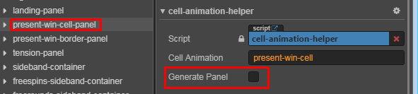
-
Present Win Cell Panel:
-
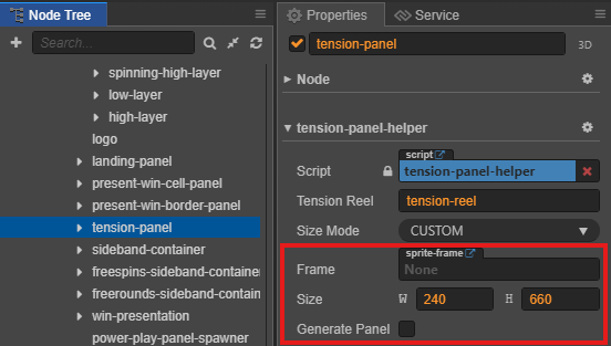
Tension Panel:
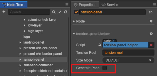
If the tension use a custom size frame, we can change the option sizeMode to Custom and set the static frame and size.
Setup UI Panel
UI Panel Overview
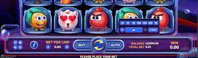
The UI system supports both desktop and mobile layouts design.
🖥️ Desktop Layout
- Full bottom bar with all controls visible
- Horizontal layout maximizing screen width
📱 Mobile Layout
The mobile interface adapts to both landscape and portrait orientations:
| Orientation | Preview |
|---|---|
| Landscape |  |
| Portrait | 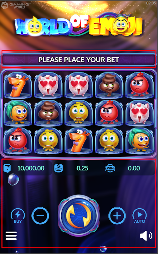 |
UI Sideband
To Be Added:
- Prepare the asset
- Run helper / p4f menu or setup manually
UI Bottom Bar Desktop
Step 1: Setup Prefab Editor
| Step | Action | image |
|---|---|---|
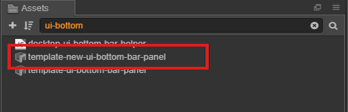
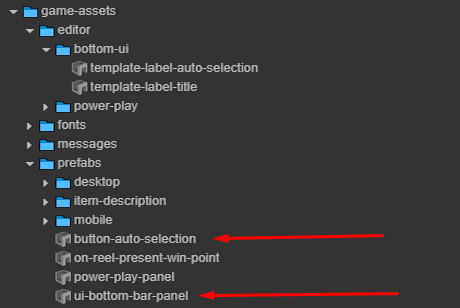
| 1. Locate Prefab | Search for ui-bottom-bar-panel prefab |
 |
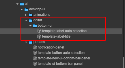
| 2. Find Assets | Navigate to core/editor directory |
 |
| 3. Clone Assets | Copy / Paste to game assets location | 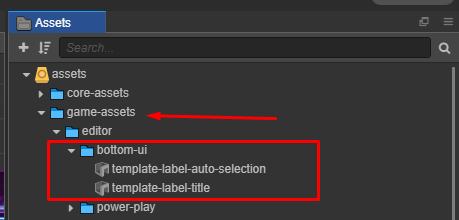 |
Step 2: Configure Prefabs
Core Prefabs Structure
Navigate to the location where the prefabs: assets\core-assets\hyper-core\packages\ui\desktop-ui\prefabs\

Rename Prefabs
Rename the copied prefabs by removing unnecessary prefixes:
| Prefix to Remove | Original Prefab Name | Final Name |
|---|---|---|
template-new- |
template-new-ui-bottom-bar-panel |
ui-bottom-bar-panel |
template- |
template-button-auto-selection |
button-auto-selection |
assets\game-assets\prefabs
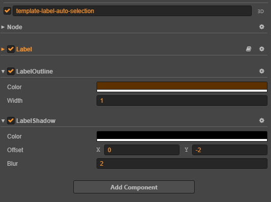
Customize button-auto-selection Label
Follow Design:
Use the template-label-auto-selection to customize the appearance of the label inside the button-auto-selection prefab.
| Component | Description |
|---|---|
| Label Outline | Add an outline to make the text stand out. |
| Label Shadow | Add a shadow for better contrast and readability. |
| -------------------- | ------------------------------------------------- |
Customize ui-bottom-bar-panel Label
Use assets\game-assets\editor\bottom-ui\template-label-title to customize the ui-bottom-bar-panel:
:::info
Follow the same configuration as Button Auto Selection Labels
Bottom bar labels include a localization component for multi-language support
:::
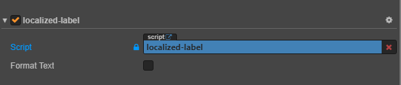
The FormatText property controls text formatting behavior for label components:
| Property | Description | Example |
|---|---|---|
default |
Initial formatting state | false |
notify |
Formatting update callback | Updates when value changes |
Step 3: Setup UI In Main Scenes
Create new node and configuration in your main scene:
Platform Node Spawner Settings
| Setting | Value | Description |
|---|---|---|
| Desktop Toggle | ✓ Enabled | Show prefabs for desktop platform |
| Mobile Toggle | ☐ Disabled | Hide prefabs for mobile platform |
| Target Prefab | ui-bottom-bar-panel |
References prefab |
Step 4: Apply Textures
Texture Button Bar
✅ Checklist assets completed for bottom UI and button UI text
🔗 Follow is by Complete Assets Structure Guide:
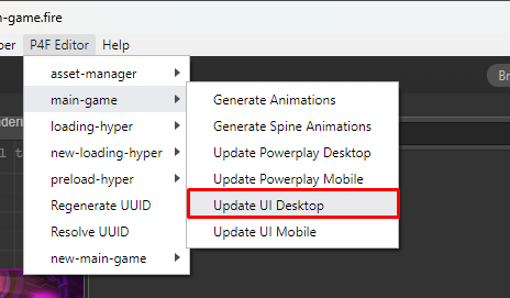
Run the Helper Tool
- Open the UI Desktop Helper
- Select texture assignment options
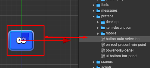
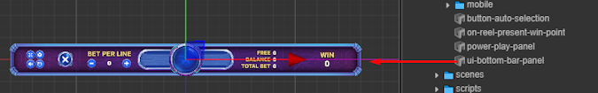
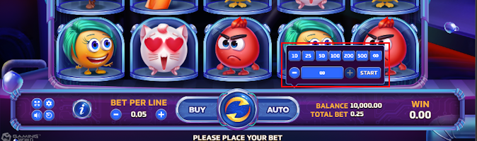
Verify Results: all new asset already loaded to these prefab
button-auto-selection prefab
ui-bottom-bar-panel prefab
In game
UI Panel Mobile
Step 1: Setup Prefab
| Step | Action | Description | Image Reference |
|---|---|---|---|
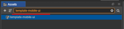
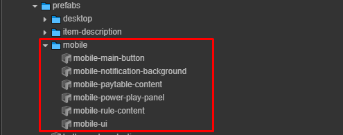
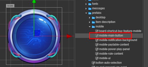
| 1 | Locate mobile-ui Prefab |
Search for the mobile-ui prefab |
 |
| 2 | Clone Assets | Copy the required assets | 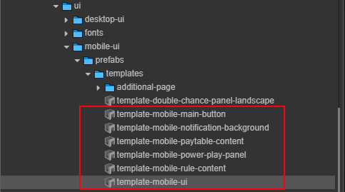 |
| 3 | Paste Assets | Paste into: assets/game-assets/prefabs/mobile |
- |
| 4 | Locate buy-feature Prefab |
Search for the buy-feature prefab |
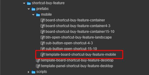 |
| 5 | Paste Prefab | Paste into: assets/game-assets/prefabs/mobile |
- |
:::tip File Structure Maintain this directory structure for proper prefab references:
assets/
└── game-assets/
    └── prefabs/
        └── mobile/
            ├── Exp: mobile-ui.prefab
            └── Exp: buy-feature.prefab
:::
Step 2: Rename Prefabs
Rename the copied prefabs by removing unnecessary prefixes:
| Prefix to Remove | Final Name |
|---|---|
template- |
 |
Step 3: Setup Ui In Main Scenes
Create new node and configuration in your main scene:
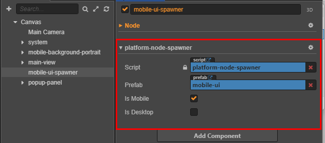
Platform Node Spawner Settings
| Setting | Value | Description |
|---|---|---|
| Mobile Toggle | ✓ Enabled | Show prefabs for mobile platform |
| Desktop Toggle | ☐ Disabled | Hide prefabs for desktop platform |
| Target Prefab | mobile-ui |
References prefab |
Step 4: Apply Textures
Texture Mobile UI
✅ Checklist assets completed for Mobile UI
🔗 Follow is by Complete Assets Structure Guide:
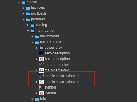
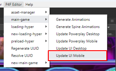
Run the Helper Tool
- Open the UI Mobile Helper
- Select texture assignment options
Results
main ui button added textures
|  |
|
Step 4: Setup Color For Menu Mobile UI
Follow Design:
|
|
|---|
Overview
The helper-paint-color-ui-mobile.js component is a customizable color painter for various UI elements in a MOBILE UI. It allows designers and developers to easily apply theme-based colors across the game interface.
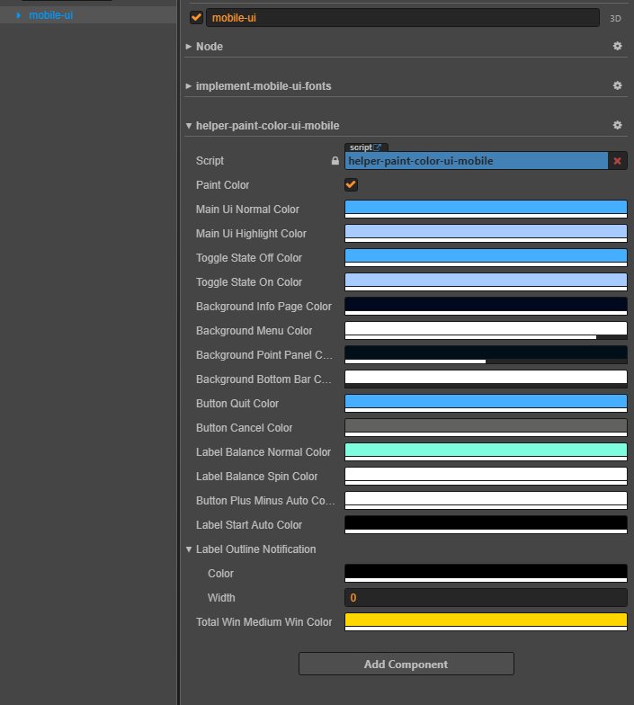
| Ordinal number | Properties | Explaination | Example |
|---|---|---|---|
| 0 | paintColor | Trigger to repaint UI components | 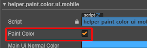 |
| 1 | Main Ui Normal Color | Default color of UI elements |                  |
| 2 | Main Ui Highlight Color | Highlight color for selected UI elements |   |
| 3 | Toggle State Off Color | Color of toggle when off |  |
| 4 | Toggle State On Color | Color of toggle when on |  |
| 5 | Background Info Page Color | Info screen background |  |
| 6 | Background Menu Color | Menu background color |  |
| 7 | Background Point Panel Color | Background panel for point/balance UI |  |
| 8 | Background Bottom Bar Color | Background bottom bar (show only mobile portrait) |  |
| 9 | Button Quit Color | Quit button color |  |
| 10 | Button Cancel Color | Cancel button color | 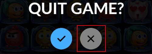 |
| 11 | Label Balance Normal Color | Normal balance label color |  |
| 12 | Label Balance Spin Color | During-spin label color |  |
| 13 | Button Plus Minus Auto Color | Button plus/Minus autoplay | 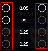 |
| 14 | Label Start Auto Color | Start autoplay label | |
| 15 | Label Outline Notification | Outline color + width config | 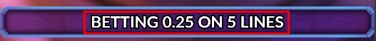 |
| 16 | Total Win Medium Win Color | Color for medium win effects | 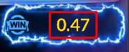 |
Setup Background
Background overview:
| Desktop | Mobile | |
|---|---|---|
Background Landscape |
 |
 |
Background Portrait |
 |
Background landscape use for Desktop and Mobile landscape.
Background portrait only use for Mobile portrait.
Prepare the assets
| Assets | Description | |
|---|---|---|
| Static |
 |
Static background is necessary for the game |
| Animation |
 |
Animation background may or may not be present, depending on the game design |
Background Landscape
We use sprite frame background for landscape from prepared assets.

Background Portrait
We use sprite frame background for mobile from prepared assets.

Background Animation
If the game have design animation for background, we will do this step.
-
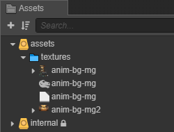
Using hepler to generate animation from prepared assets
-
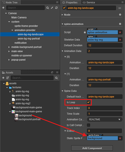
We have the result as below, and continue setup for spine-animation.
- Is Loop: is ✅ because this animation will play through the game.
- Static Sprite Frame: It will be displayed when the animation has not finished loading.
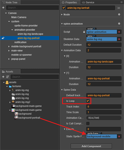
-
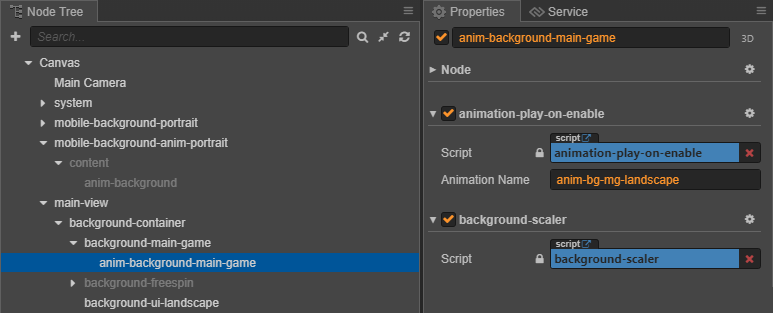
Add animation background with component below:
Animation background landscape
- Create Empty Node with name anim-background-main-game.
- Add animation-play-on-anable with animation name in Animation Provider.
- Add background-scaler resize with screen resolution.
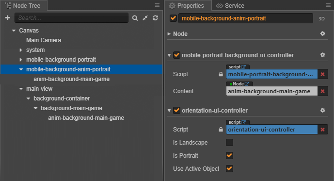
Animation background portrait
- Create Empty Node with name mobile-background-anim-portrait.
- Add mobile-portrait-background-ui-controller to display only on Mobile.
- Add orientation-ui-controller to display on Portrait with the options below.
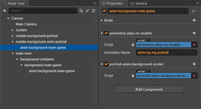
- Create Empty Node with name anim-background-main-game.
- Add animation-play-on-anable with animation name in Animation Provider.
- Add portrait-anim-background-scaler resize with screen resolution.
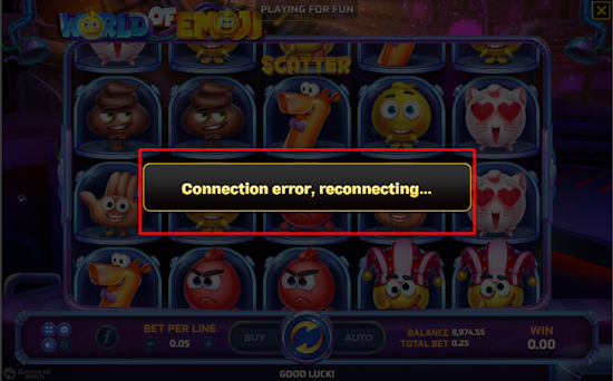
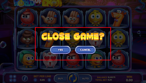
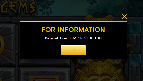
Setup Popup Panel
Overview
A popup is a temporary UI element that provides additional information or options to the user.
 |
 |
 |
|---|
Popup in the Game
The popup panel is already integrated into the main scenes template-main-game.
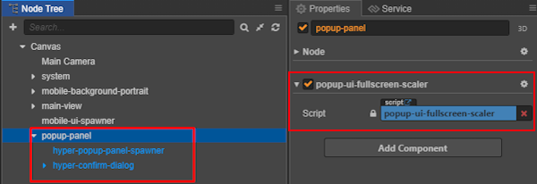
| Node Type | Location Description | Screenshot |
|---|---|---|
| Definition Node | Before configuring the popup prefab | 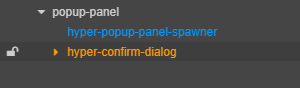 |
| Positioning Node | After adjusting the prefab's position in scene | 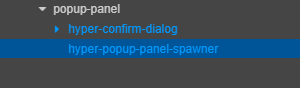 |
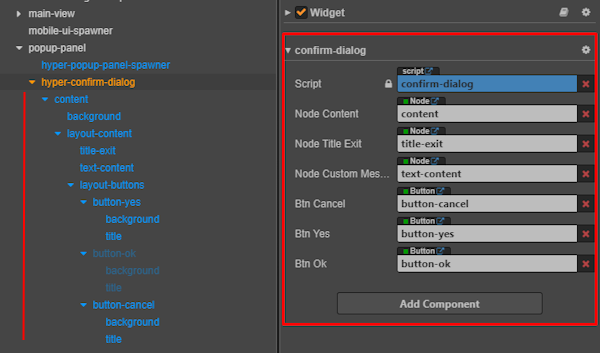
Detail configuring:
Multiple Popup Panel:

To use the Multiple Popup layout, reference target hyper-multiple-popup.prefab in core:
:::info
Path : assets/core-assets/hyper-core/packages/popup-panel/prefabs/hyper-multiple-popup.prefab
:::
Manual Popup Panel:
- This popup is self-configured using shared textures and layout structure.
- The color theme and style may vary depending on the game design.
⚠️ Note: The Exit Game Popup only appears in Desktop.
Texture Path & Asset Info:
✅ Exit popup textures have been successfully packed.
🔗 Refer to the full asset structure guide: Complete Assets Structure Guide
Texture Path::
assets\game-assets\textures\desktop\preloads\main-game\exit
Preview Result: